Nowadays when anyone needs to get information, we grab our smartphones. It’s light, portable and can provide us with a plethora of information in a matter of seconds. According to a 2019 study, mobile users accounted for over 51% of all internet page views worldwide. That means that every other visit to your site is being seen on a mobile device, and that’s why mobile-friendly design is crucial to your business.
This may not seem like a big deal, but the fact of the matter is that website on a desktop screen and website on a mobile display can appear very differently if not properly developed. And not only does it have to look good, but it also has to function as a mobile site as well.
What Does a Mobile-Friendly Website Look Like?
There’s a few key features of a mobile-friendly website.
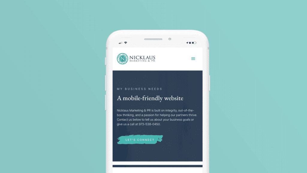
- Condensed navigation. Condensed navigation allows a user to fully see view an entire page without any distraction. Usually, the navigation gets condensed into a single button that expands a menu that fills the whole screen.
- A vertically-oriented flow. Vertical images, all content is stacked instead of any horizontal columns. You should never have to scroll left to right on a mobile site.
- Text large enough to be read on a phone screen. Text on a desktop vs. text on a mobile device varies greatly! Plus you have to take into account that a person on their mobile device may be outside with glares, etc.
- Usually larger buttons and CTAs (Calls-to-Action). When you’re on a desktop, you have this handy-dandy mouse to make very specific selections for you! Sometimes our fingers can be a little clumsy, so big buttons prevent mistakes and make the user’s experience less frustrating.
- Extra compressed images and graphics. As with any site, images and graphics need to be compressed into a smaller file size to prevent long load times. This is amplified with mobile sites, being as we’re not always connected to wifi when we’re trying to look something up. The quicker the site loads, the more likely a user is to stay on it.
- And sometimes, a “back to top” button. Being as things are stacked now, it can be annoying to scroll all the way back to the top to get back to the main navigation. These buttons come in handy.

Responsive Design
Another reason why mobile-friendly design is crucial is that it can significantly affect the way your website displays on a smaller device! This is where responsive design comes in.
Responsive web design refers to a website’s ability to “respond” to a device’s display size, thus appearing properly whether someone is viewing on a desktop, a tablet or a smartphone. Responsive design is all in the way the site is coded in the backend. This may entail condensing your main navigation bar into a singular button. Resizing and regrouping sections of text so they’re legible, or even adjusting the orientation of images on your site so users with smaller devices can easily see them.

Mobile-Friendly = Conversions
Have you ever been out looking for a restaurant or coffee shop, and you find a site of a place nearby and you just want to glance at the menu. But instead of having the menu laid out larger or just in text so it’s easy to read, an image of the entire folded menu is cramped on your screen. You click and pinch and expand and you just can’t manage to read what’s in this image! On a desktop screen, it would’ve been no problem, but clearly these developers didn’t consider responsive design for mobile users!
It’s rare that mobile users will put in extra effort to get the information out of your site when it’s not formatted for mobile. Why? Because in 2 seconds they can just click back to the search results and pick a competitor who has formatted their site for mobile use. Competition is everywhere these days— there’s no point in spending the energy to show up higher in search results if people are going to click off your site in seconds. And that’s why mobile-friendly design is crucial! Retain the customers that come through your site and those visits will convert.

Mobile Shopping Is the New Wave
If you have an e-commerce site, you have one main goal— sell! Studies in recent years have shown that now users prefer to shop on their mobile devices. People are already constantly on their phones, so take advantage of that! And especially with new implementations of Apple Pay or Samsung Pay, users can check out without ever having to get up to get their credit card. All they do is touch their thumb to the sensor and the order is placed. These kind of mobile-friendly functions allow users to make more spontaneous decisions and get instant gratification, without giving them the chance to think them through.
According to OuterBoxDesign.com, “Almost 40% of all eCommerce purchases during the 2018 holiday season were made on a smartphone.”
That’s why mobile-friendly design is crucial! If people can’t shop on your mobile site efficiently and without frustration, they’ wont. It’s that simple.

But That’s Why We’re Here
We know that the age of technology is moving quickly and it can be overwhelming to try to take all precautions necessary to get ahead of the curve. Our web design services always take the mobile experience into account, at absolutely no extra fee. (Afterall, half your client-base will be viewing your site on mobile devices!)
Now that you understand why mobile-friendly design is crucial to helping your business grow, what are you waiting for? And there’s no time better to start than now! Check out our blog post about why right now is the time for a new look! While you’re at it, make sure your site is getting all of the visitors it should! Make sure your website is up to date with the latest SEO optimizations. (Or we can do that for you too!)
Want to learn more about our services, check out how else we can help!


